
イタリアワイン通信講座
楽しめる教科書をつくる
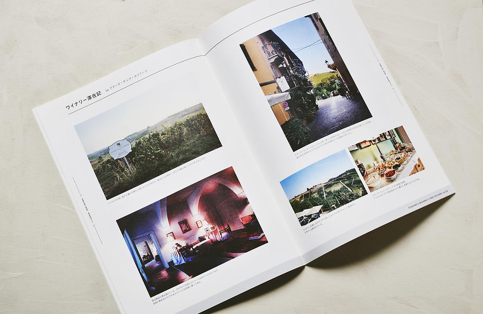
全12回にわたるイタリアワインの教科書づくり。編テーマになったのは第一に、楽しみながら学べる教科書をつくること。そしてもう一つ、イタリア現地の文化と風土を体験できるようにつくること。
岩田デザイン事務所では、ロゴ、冊子の編集デザイン、バインダーなど、デザインをトータルで担っています。
Italian Wine Correspondence Course
Creating a Textbook That Can Be Enjoyed
A twelve-part textbook series on Italian wine. The primary aim was to create a textbook that allows readers to learn while enjoying the process. Another key objective was to design the material so that readers could experience the culture and terroir of Italy itself.
Iwata Design Studio was responsible for the overall design, including the logo, editorial design of the booklet series, and the binder.
イラストや写真を多用
Extensive Use of Illustrations and Photographs
現地をスケッチする写真集的なアプローチやイラストを多用することで、イタリアワインの複雑にして込み入った知識の習得に、体感的な楽しさが得られるように構成しています。
By incorporating numerous illustrations and photographs—sometimes taking an approach similar to a sketchbook-style photo collection capturing scenes from the region—the structure allows readers to gain an intuitive and enjoyable grasp of the complex and intricate knowledge surrounding Italian wine.
色のアーカイブ
An Archive of Colors
題字のカラーは毎号変化し、全12回のシリーズが蓄積されたとき、12色展開のカラフルなコレクションとなるよう設計しています。
The color of the title lettering changes with each issue. When the full twelve-part series is assembled, it forms a colorful collection composed of twelve distinct colors.


イタリアワイン通信講座
CREDIT
Design: Iwata Kazunori
Illustration: Hashiguchi Haruka, Iwata Kazunori
Client: Vino Hayashi
2020–2021
