
Tazawako Base
展開する産業の波紋
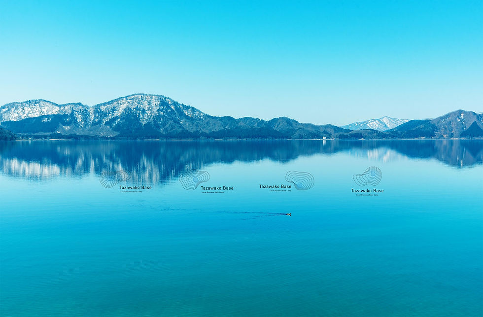
田沢湖駅前のコミュニティスペース&シェアオフィス「Tazawako Base」のロゴ、名刺などをデザインしました。
田沢湖から先端技術産業の波が拡大していくさまをマークにしています。波紋の線形はコンピュータの計算式で自動算出して描いており、さまざまな線形が無限展開できる設計になっています。ロゴ自体もまたテクノロジーによってできていることを表しています。
Tazawako Base
Expanding ripples of industry
Iwata Design Studio designed the logo and business cards for "Tazawako Base," a community space and shared office located in front of Tazawako Station.
The logo mark symbolizes waves of high-tech industry expanding outward from Lake Tazawa. The linear patterns of the ripples are automatically calculated and drawn using computer algorithms, allowing for an infinite expansion of various forms. This design reflects the fact that the logo itself is a product of technology.
ロゴについて
About the Logo
田沢湖を中心に展開していく波紋が、さまざまな形態に変化します。用途に応じて無限の形態バリエーションが可能なロゴデザインです。
The ripples radiating from Lake Tazawa transform into various shapes. This logo design is built to allow for infinite variations depending on its intended use.
.jpg)
キーカラーはブルー
Key Color: Blue
ロゴ、名刺ともに田沢湖の水の色、ブルーをキーカラーにデザイン設計しています。
For both the logo and business cards, the design is centered around blue—the signature color of Lake Tazawa’s water—as the key color.


Tazawako Base
CREDIT
Design : Kazunori Iwata
Client : Contents Keikaku
2018
.jpg)